A Complete Anatomy of High-Converting Product Pages

Feb 15, 2024
You've created an awesome ad campaign or attracted visitors to the product page through SEO, but still, no conversions are happening. Ugh, nothing can get worse.
Well, believe it or not, today's customers are incredibly impatient. They analyze your webpage within a mere 2 seconds of landing on it, deciding if it's worth their time or if bouncing back is the better option. So, how do you make them stay? And how do you turn that lead into a customer?
The answer lies in enhancing your product pages for a superior user experience – by ensuring it is aesthetically pleasing, organizing product information effectively, and implementing proven UX techniques.
In this blog, you’ll get the complete anatomy of a conversion-optimized product detail page in a handy checklist. Discover what components should be present on the product pages, where they need to be placed, and why. These insights will help you keep your customers on your product pages for longer and guide them further along the purchase journey.
Towards the end of the blog, I'll also share an excellent solution to make your product pages the most attractive of all, boosting your conversion numbers.
We'll begin by exploring why the design and structure of an eCommerce product page are given so much attention. And if it can genuinely be reasoned for your lower conversion rate.
Let’s start.
Why are Well-optimized Product Pages Important for Conversion?
When it comes to selling, putting in extra effort to convince your customer is crucial.
Your product page works as your ultimate selling platform and is responsible for converting visitors into buyers. However, it can't fulfill its role effectively if it's disorganized and lacks a structured product information, attractive themes, or other elements that matter for customers' purchase decisions.
Customers are less likely to purchase if the visual elements fail to grab their attention at first glance or if the information is not presented in clear and well-arranged sections.
When you optimize your product pages for a better user experience and ensure that each piece of information is strategically placed, your visitors will easily spot them at first glance. This will encourage them to explore further and gain a deeper understanding of your product, leading them towards a purchase.
Remember, the first impression is often the last. Compromising on the aesthetics or an attractive website design can negatively impact the initial impression that your business makes on potential customers.
I hope this has given you a clear idea of how important it is to optimize your product pages to match your ultimate goal of conversion. Lastly, these insights must have sparked curiosity about how a perfect product page would look.
So, let’s move on and understand the main section of this blog, the anatomy of a perfect product page that helps you convince your customers to make a purchase.
Ready to know how you’re going to make your product page well-structured and near-perfect?
Let’s get to understanding it.
Anatomy of a High Converting Product Page
If your product page isn't generating conversions today, it doesn't mean that it can't do so in the future. The key is to understand the structure of the product page that makes it effective.
Here, we’ll discuss the key sections that help you create a “standard product page”. Whether you’re designing a landing page dedicated to a single product, or a specific group of products, or you’re aiming to revamp your existing product pages to make them appealing and user-friendly, this checklist of anatomy has you covered.
Let’s delve into understanding it.
1. High-Quality Product Images & Videos Describing Products
When it comes to shopping online, what do you want at first?
A clear view of products. Right? Similarly, your customers' purchase decisions depend solely on product imagery. Whether it's photos, videos, or tutorials, visually appealing content has the power to build your customers’ trust in your products.
Without a clear view of products, it’s difficult to capture visitors' attention. If you fail to provide high-quality product photos and other visual content, you may face an adverse effect, leaving an impression that your products are cheap or of low quality.
Let’s look at an example.
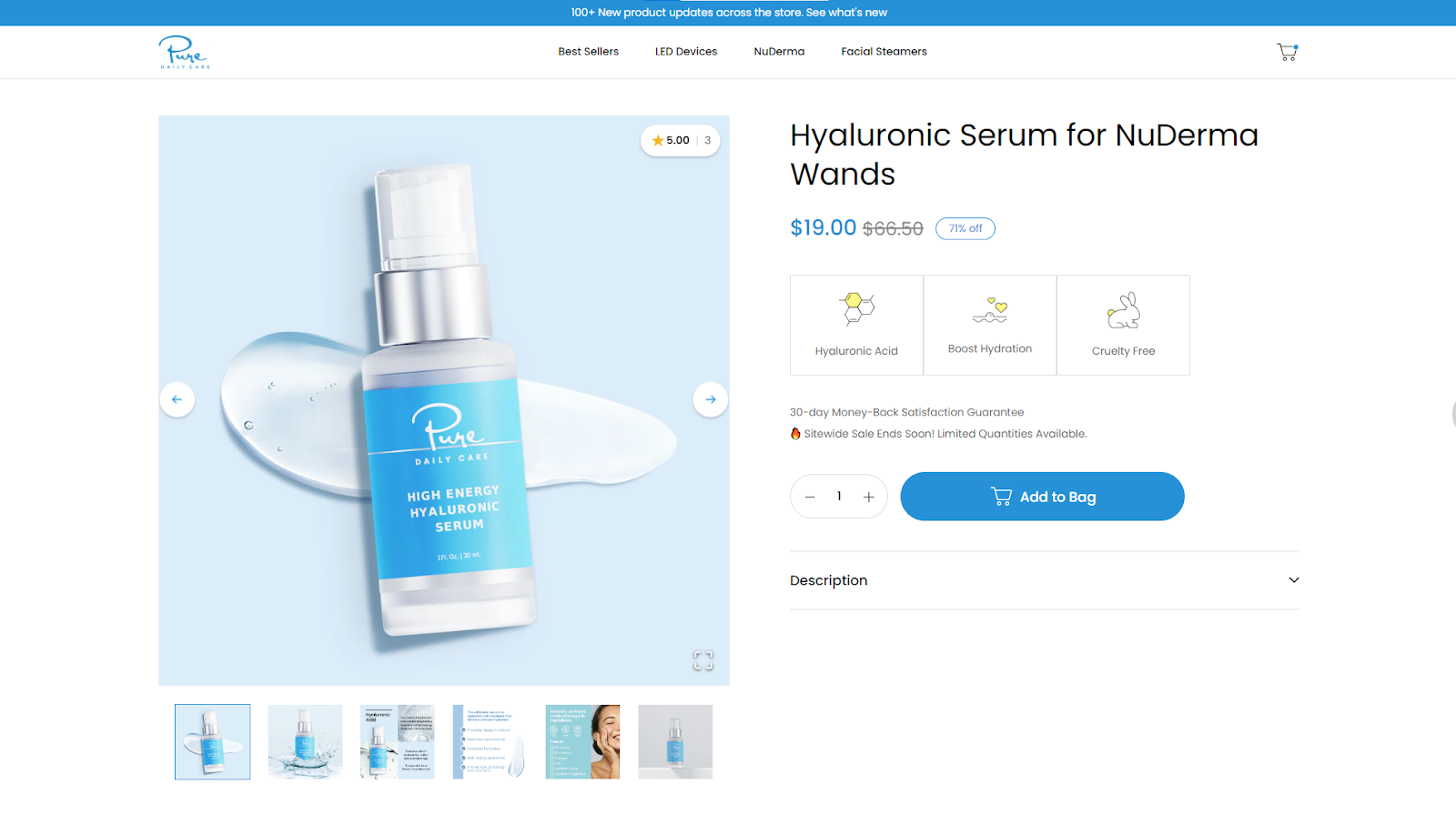
The first impressions made by this beauty brand are excellent. You can spot how conveniently and effortlessly they showed their products.
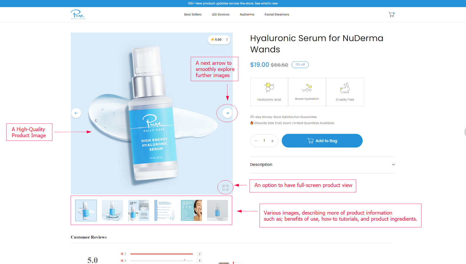
So, the first step is to utilize high-quality and professional product images, considering it a standard method. Additionally, here are some other best practices you can follow to structure your product imagery in a better way:
- Add video tutorials, users are 64-85% more likely to purchase after watching a product video.
- Include images from various angles to provide a realistic perception of what the product is like.
- Photograph the product in each available color or material for a consistent series.
- Maintain consistency in the background of your product images.
- Add images showcasing your products being used by real people.
- Mention the size and dimensions of the product in the images.
That was it about the product imagery section. Let’s move to understand what’s next.
2. Detailed Product Description with USPs
When users navigate your product pages, they crave more than just a glimpse of your products; they want to gain a deeper understanding of its features, functionalities, the benefits that they get, and how they can use them or care for them.
If all this information is presented in a messy or complex manner that's hard to read, customers won't struggle to understand it; they'll simply decide not to explore further.
So, make sure your product description includes each piece of information your customer should know about the product and how it will positively impact their lives. The more organized you present this product information, the more they will indulge in your offerings, gaining confidence in their purchase decision.
Let's check an example from a beauty brand.
You can see how they've made it easy for potential buyers by clearly mentioning which skin issues their product is designed to address.
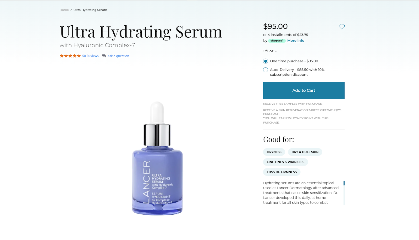
Additionally, on scrolling down, we can see how wonderfully they've shared additional information related to the product, be it the benefits, before-and-after results, or the way to use it—all while considering eye-catching design and a pleasing structure.
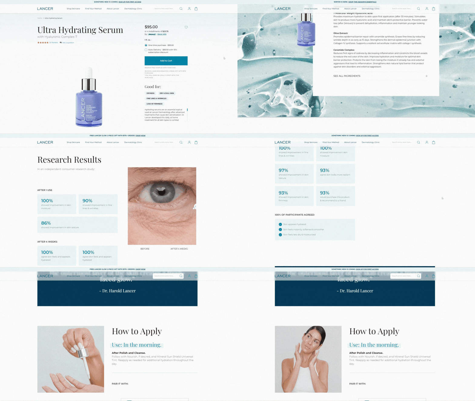
You can also follow a similar structure to present your product information.
Here are some other best practices that you can consider.
- Write comprehensive but scannable product descriptions using bullet points, icons, and an easy-to-read design.
- Maintain a consistent tone that speaks directly to your target audience.
- Explain product features as their benefits, telling potential customers why they should buy it.
- Use relevant keywords to improve search engine visibility.
- Include a product demo for guidance, explaining how to use it. For technical items, show how to assemble it in a video guide.
- Add videos of influencers using your product.
That is all you need to do to impress your potential customers with your product description.
Let’s move on to understanding the next part of the product page anatomy.
3. Attractive Call-to-Action (CTA) Buttons
For most product pages, an "Add to Cart" or "Buy Now" button serves as the primary CTA button.
This button guides your customer further in their purchase journey. If it is not positioned correctly or lacks excitement to convince your customer to click, all your efforts on your product page or on any other web page may go to waste. This is because the customer is not taking the desired action(clicking on the CTA button), preventing you from achieving your conversion goals.
Here's a perfect example of how a CTA button should be placed.
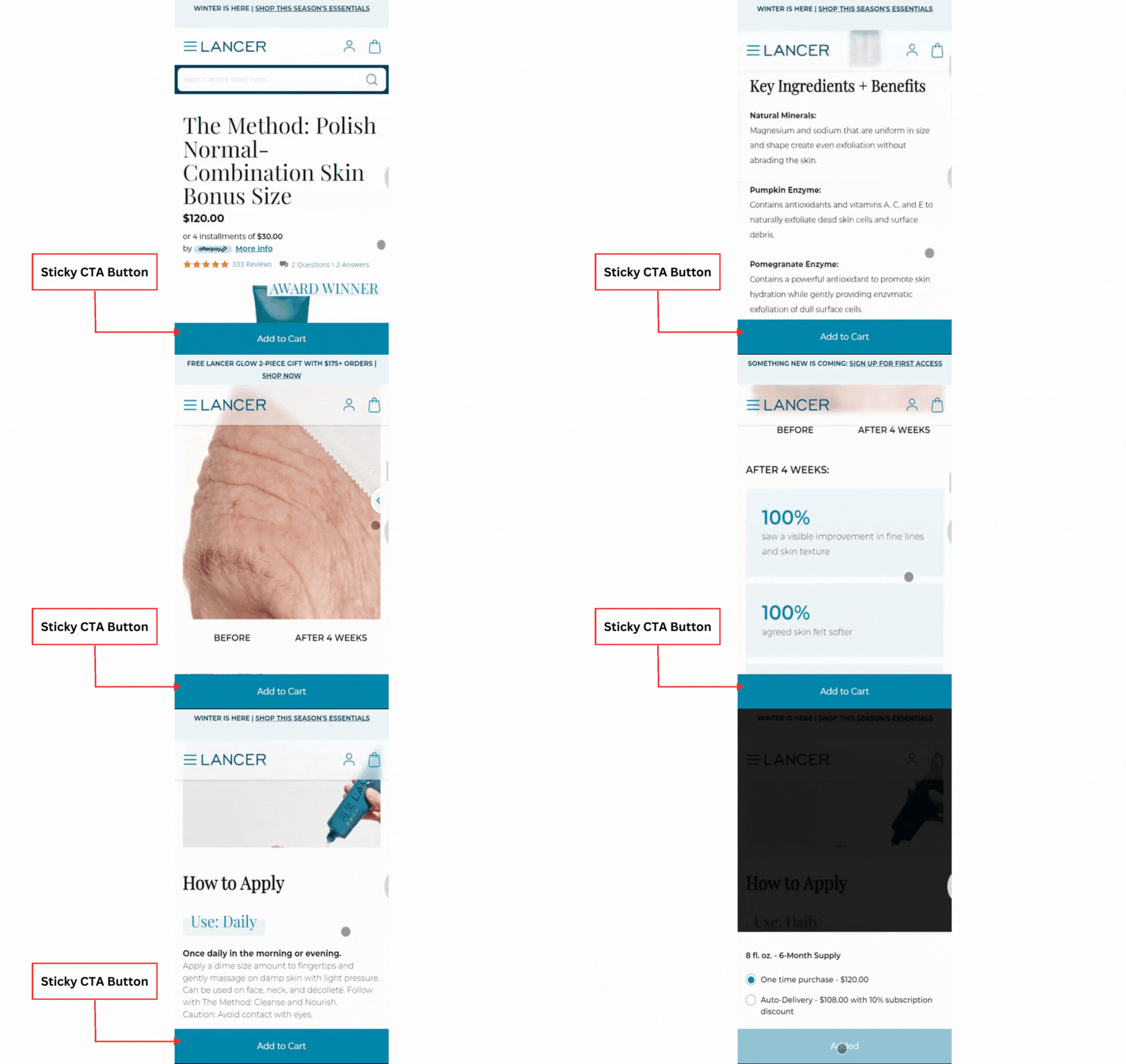
You can see that the CTA button is sticky to the bottom of the page, allowing users to scroll through each product detail and then add it to the cart, without getting lost in a maze.
They also used bold color for CTA, making it the most highlighted object on the entire product page.
And it's the best thing you can consider implementing on your product page.
Lastly, let's explore some other best practices you can try your hand at for CTA buttons on the product page.
- Keep a single CTA on the entire product page, with the most highlighting and pleasing design; avoid sprinkling them all over.
- Place enticing offers near the CTA button, such as "Save 10% on your first purchase."
- CTA color and design have a significant influence, try using better colors that match your brand with attractive shapes that match your aesthetics.
- Without a doubt, keep your CTA button sticky as you scroll, whether to the top of the page or below. Additionally, The bottom side is more convenient to place, as customers' thumbs can easily be reached while shopping from mobile devices.
That was it for things you can follow to enhance your CTA on the product page.
Now, let's check another element of the product page anatomy.
4. A Solid Social Proof
Social proof for the product page is past customer reviews.
Often, customers perceive the professional-looking product images, videos, and descriptions on your product page as scripted. I'm not stating that adding strategized product content isn't valuable; it's highly necessary. However, customers prefer checking ratings and reviews to place trust in your product and address additional doubts.
It’s true, in a survey, around 82% of customers said that product reviews (social proof) have convinced them to make a purchase.
Customers believe in gathering social proof as they want to understand – how your products look in real life, how they work for people similar to them, and if your products consist of the unique features you've highlighted on the product page – to make a mindful choice on purchase.
This emphasizes the importance of the reviews section on the product page and how it influences customers' purchasing decisions, thereby prompting the need for extra attention while designing.
Now, to help you achieve this, here I’m sharing an ideal example of how you can organize ratings and review sections on your product page.
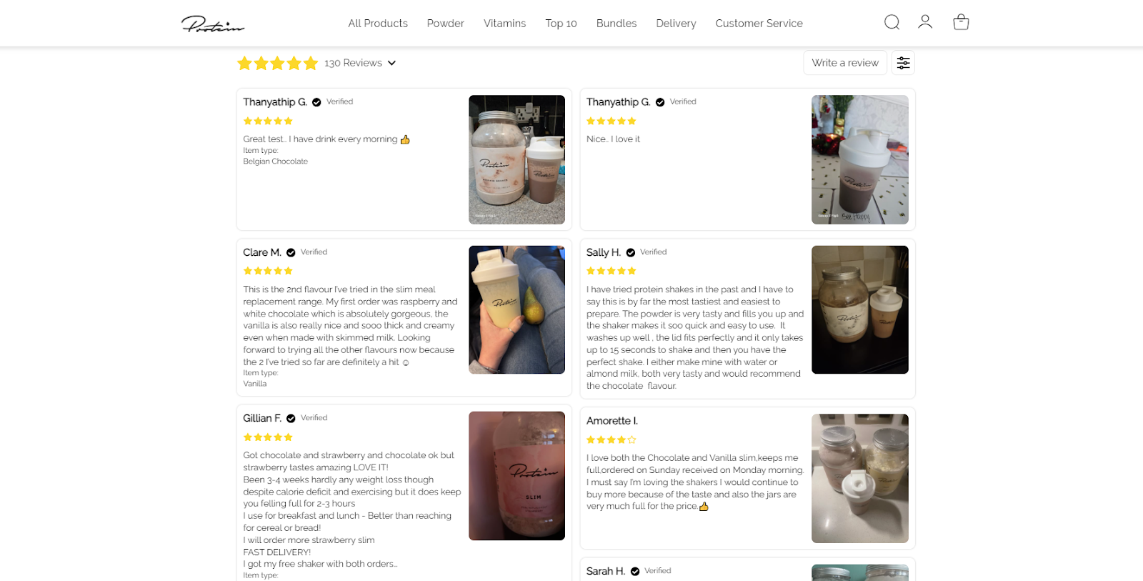
You can see that it’s designed in a way that makes it easier for users to read the reviews, along with product images and videos added by reviewers. This adds a trust factor, indicating that the product is genuine and worth buying.
Another thing, the review section is often placed at the bottom of the page, after mentioning each product detail. So, you can consider adding a quick link to the review section, and make it convenient for users to find it quickly.
Here’s an example of the same.
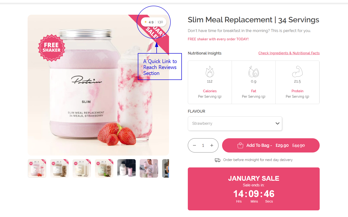
We examined the best example for presenting the review section, and now let’s explore additional best practices to enhance it.
- Display the overall star rating for your product, along with the total number of reviews.
- Keep the "Write a Review" button attractive to encourage past customers to share their feedback.
- Add an anchor link to the reviews section beneath the product title or on product images for easy navigation.
- Simplify the review process for customers by avoiding long forms or complicated steps that might discourage feedback.
- Ensure that the reviews section is mobile-friendly, allowing users to easily swipe through images and videos, uploaded by reviewers.
- Having 100% positive reviews can appear unrealistic and may be perceived as scammy. Therefore, don’t remove every negative review; leave behind 1-2.
That is all you can do to present social proof in the right way.
Let’s move to another crucial feature of the high-converting product page.
5. Personalized Product Recommendation
Personalized product recommendations mean suggesting products based on what your customer is currently exploring. It’s nothing but a fancy term for cross-selling and upselling such as “you might also like these”, “similar products”, and other suggestions often observed while shopping online.
Why do you need to place them on your product page?
It’s basic human behavior that we don’t buy anything without exploring options. So, relevant product recommendations help make your users' purchase journey convenient by providing them with similar options to explore or even offering complementary products to their current interests.
This helps you convince your customers to add more products to the cart and increase the average order value (AOV) without seeming salesy. A recent survey by Salesforces recognized that product recommendations can increase revenue by 26% and helps drive 24% more orders.
Here are some types of product recommendations you can try your hands on.
- Frequently bought together
- Add-on recommendations
- Complete the look recommendations
- What people like you bought
- What other customers are buying now
- People also viewed
- Product bundles
- Trending products
Let's take an example from the world's biggest eCommerce store, Amazon.
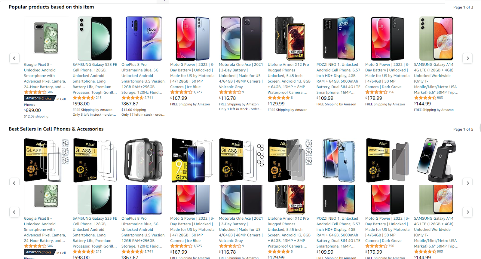
Can you guess the product I was searching for based on the product recommendations Amazon has for me?
Yes, you guessed it right. A mobile phone.
You can see how accurately it suggests alternate versions of the mobile phone I was exploring, along with mobile accessories that complement my recent interest.
Lastly, let’s check some best practices you can follow for the same.
- Try to suggest a combo pack that includes complementary products.
- Keep this section a little closer to the main product.
- Make sure your recommendations section fits better on smaller screens.
- Try experimenting with different types of recommendations to figure out the one that works best for your niche and customers.
That was it for your product recommendation section. Let’s check what comes next.
7. Certifications & Trust Badges
From the time eCommerce was born to now, we've heard many horror stories of how online shoppers lost their money, got their card information stolen, or lost their cash by simply ordering a product online.
In fact, in a study by Baymard, 18% of abandoned cart users said they didn’t trust the brand with their credit card information, so they turned off their decision to place an order. This clarifies that customers who are new to your brand will doubt your offerings.
And the only cure is providing a trust factor, such as certifications and trust badges that your brand has earned. If your product page includes them, your visitors will find it easy to put trust in your offering and would consider making a purchase.
Let’s check some examples.
Here's how a skincare brand presented a badge of certification received by their product right in the product image.
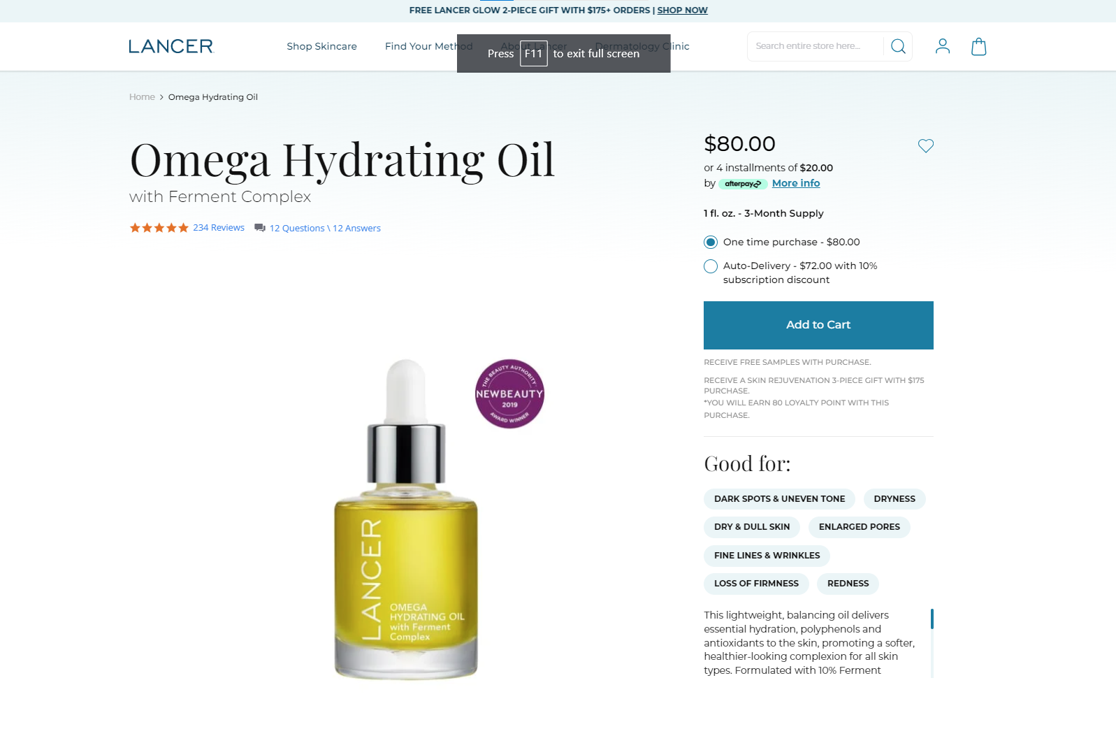
This shows that the product is trustworthy and has been working effectively for many people. Let me present another example.
You can spot how effortlessly the hospitality equipment brand has implemented their product certification in between the product description. You can also consider following this method.
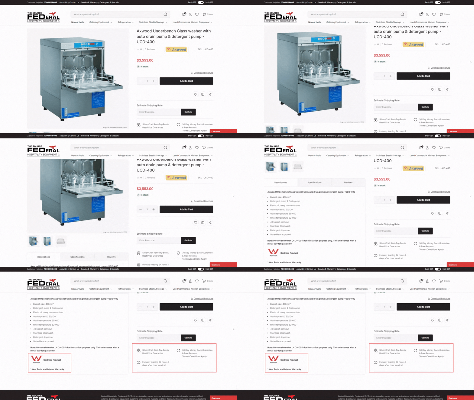
Now, let’s check some of the other best practices that you can follow.
- Position your certifications and trust badges prominently, ideally near the product description, price, or the call-to-action (CTA) button.
- Use clear and high-resolution images of the badges for better visibility.
- Highlight well-known and reputable certification organizations that are relevant to your target audience.
- Avoid overcrowding your product pages with too many badges.
- Ensure that the badges align with your brand's visual identity.
- Provide a link or pop-up with more information about each certification when the badge is clicked.
These are the best ones you can consider.
Let’s move to understand another element of high-converting product pages.
8. Frequently Asked Questions
Customers often have common queries while building up their purchase decisions relating to various areas such as shipping, return, exchange, or more depending on business niche. An FAQ section can help address these questions without requiring them to search through the entire website.
A clear and concise information on product pages can help enhance overall user experience. Customers appreciate having easy access to relevant details, and FAQs contribute to a more user-friendly interface.
Here’s a design inspiration for placing the FAQ section.

Let’s check some best practices you can follow while you enhance your FAQ section on your product page.
- Answer common customer queries
- Use headers and subheaders to create a hierarchy and improve readability.
- Avoid bulky sentences and use bullet points or numbered lists to break down information into digestible chunks.
- If a question leads to more detailed information on another page, provide a clear and visible link to that page.
- Maintain consistent branding, styling, and formatting to match the website's overall look and feel.
This was it. You can consider implementing these tips when you design the FAQ section for your product pages.
Now, let's move on to understanding the last element in the anatomy of high-converting product pages.
9. Customer Service Options
Customers frequently have questions or concerns about a product while browsing, needing more details about features, specifications, how to use it, and more. And it’s a bit of a hassle to go to the "Contact Us" page and look for support.
When you display customer service options like live chat or a hotline number right on the product pages, customers can quickly get answers without being sent to another page. It not only makes things simpler but also builds trust in your brand, fostering a sense of comfort for potential buyers.
Also, if customers face any technical problems while buying, having immediate support will stop them from abandoning the purchase decision. It makes their shopping experience smoother and customers are more likely to complete their purchase successfully.
Let’s check an example of how you can place it on your product pages.
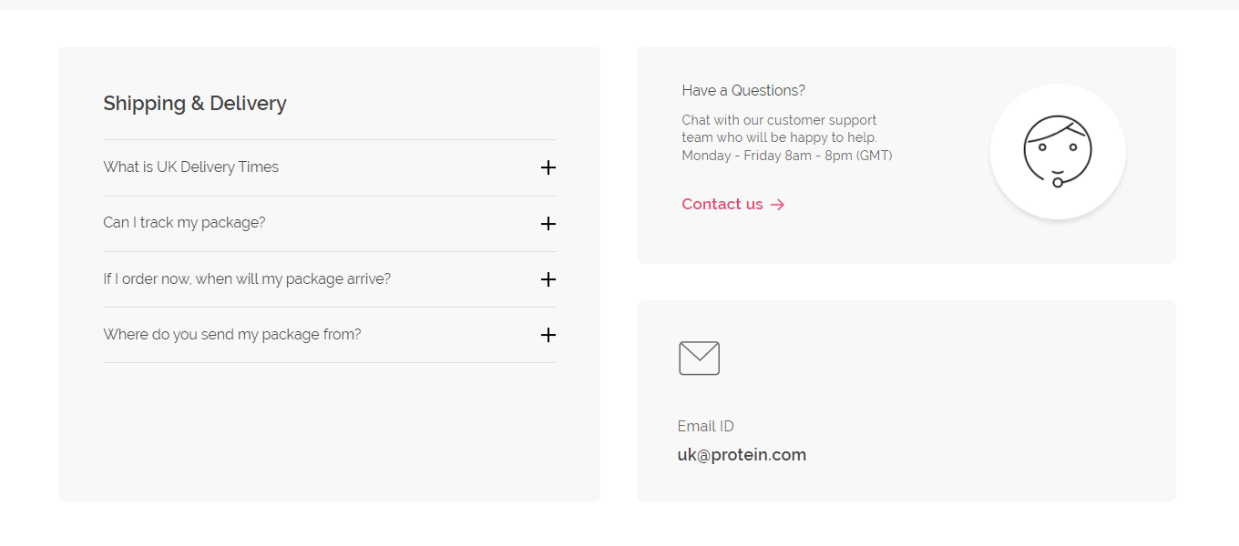
You can similarly place the Contact Us button, along with an option to reach you through email.
Let’s check some more best practices that you can follow.
- Consider placing it near other essential elements like the product description, price, and "Add to Cart" button.
- Keep the FAQ section nearby to help users find answers to common questions without needing to contact support.
- Use clear and concise labels for your support options, such as "Customer Support," "Help Center," or "Contact Us."
- Avoid vague terms that might confuse users.
- Personalize the support information based on the user's location or browsing behavior.
- Use positive phrases like "We're here to help" or "Contact our friendly support team" to create a positive impression.
And that’s all for how you place customer service options on your product page. Along with that, we’ve now discussed all the elements of the product page anatomy.
I hope you got a clear idea of how impactful each element is and a little mismatch in design can lead to a bad customer experience.
Now, you may have questions about how to implement all these standard rules on your product page. If you need a UX designer and developer working by your side, or are there ready-made templates that best match your niche and help you create a perfect product page that converts?
Let’s learn about that in the next section.
Where to Find a Highly Converting Product Page Template?
No matter, if you’re planning to custom-build your product page or looking for ready-made templates to integrate — Mini Store has you covered.
Let’s learn about Mini Store services in detail.
Mini Store is a platform that helps you go beyond just templates. From intuitive design ideas to robust eCommerce anatomy, it is a one-stop solution for you to have stunning and user-friendly website designs.
It is a highly convenient eCommerce design solution for each business size, niche, platform, and more. Mini Store has over 80+ templates to integrate within 15 minutes that are well-optimized for performance on search engines. Or you can contact their UX experts to custom-build your online store.
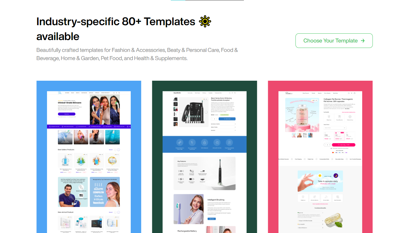
Mini Store has one significant benefit; they claim that their conversion-optimized web templates can help store owners reduce their ad spend and increase their ROAS and ROI.
Additionally, they offer an option to get started for free. Isn’t it a great opportunity to give it a try and see your sales soar?
Visit Mini Store Here.
Final Words
No matter your goal—boosting conversion numbers or enhancing your presence on search engine result pages—this product page anatomy is all you have to follow.
For an easy solution to enhance your product page layout, you can consider using Mini Store services. It's a great and highly convenient way to get started. Lastly, if you have any doubts about the product page anatomy, Don’t hesitate to contact us or leave a comment below.
Thank You.
